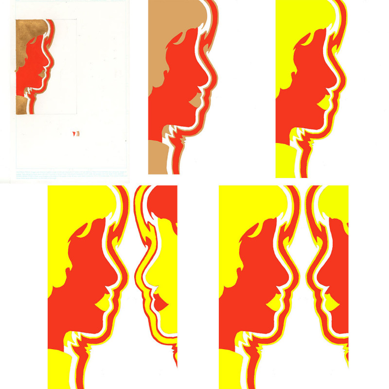
These roughs (painted gouache) show the dualistic facial idea begin to take shape. This idea was ultimately rejected for a more solitary approach to create the sense of loneliness and strength of the main character.
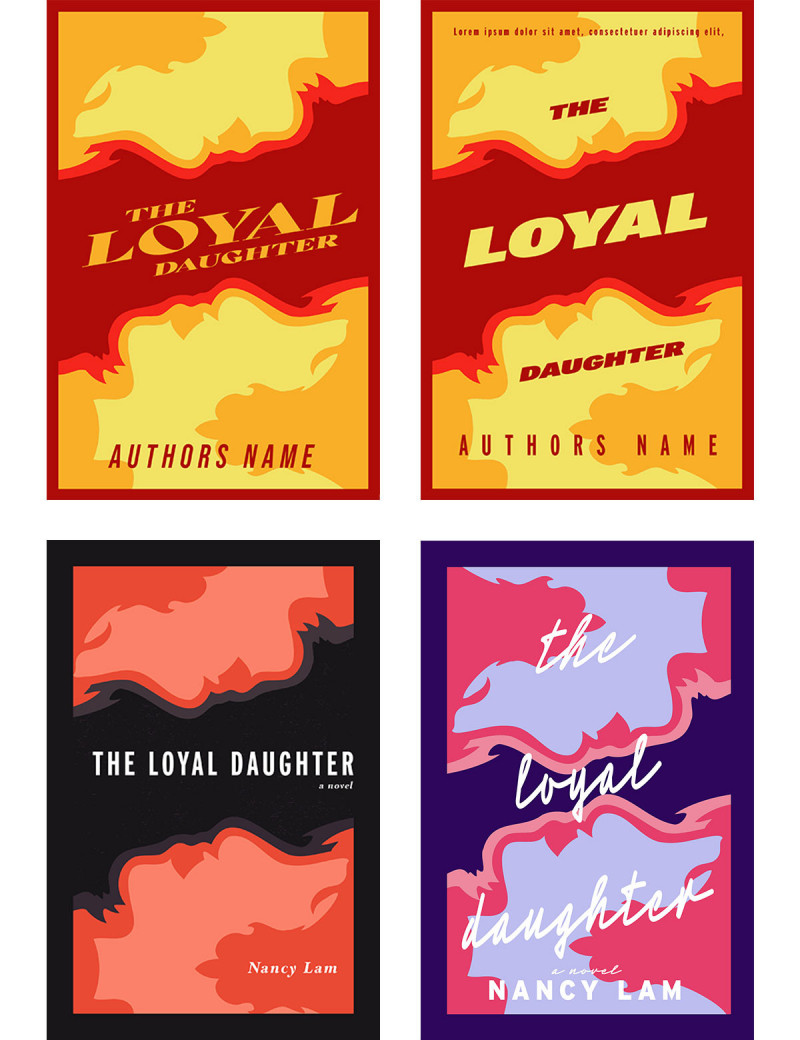
In these refined examples we see the various design approaches and typography arrangements that would eventually be rejected. It is also important to note the colour palate choices for these covers and their cultural significance. The author provided valuable advice on these colour palates and the significance of them in Chinese culture.
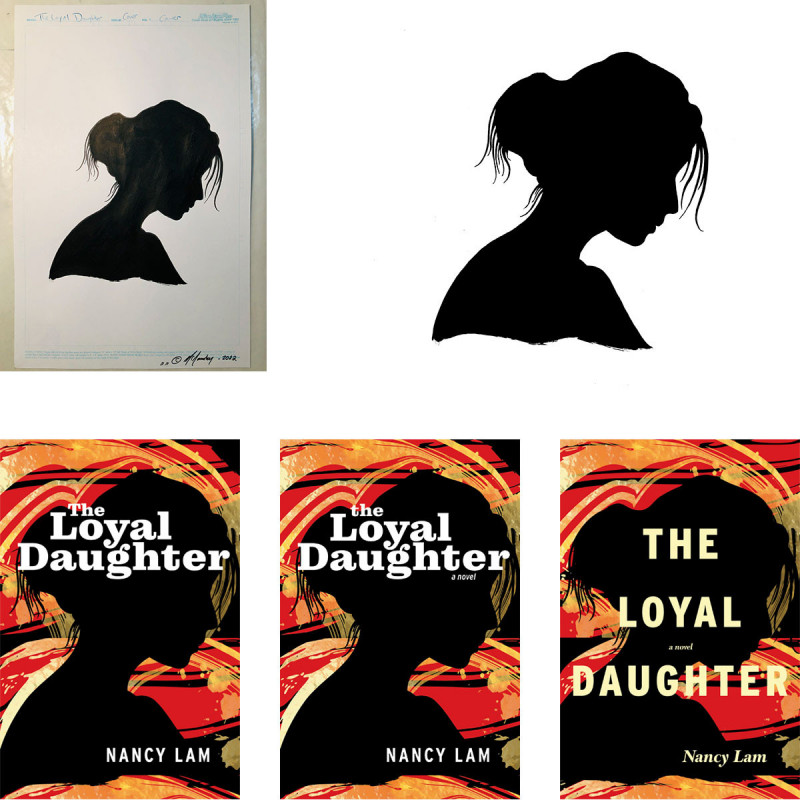
Here we begin to see the final colour palate and design take shape. We also see how the designer is playing with the typeface choices and begin to iron out the final typography.
Please enjoy Nancy Lam’s appearance on The Social, November 2nd, 2022.